ABAVAS
ABAVAS WINERY
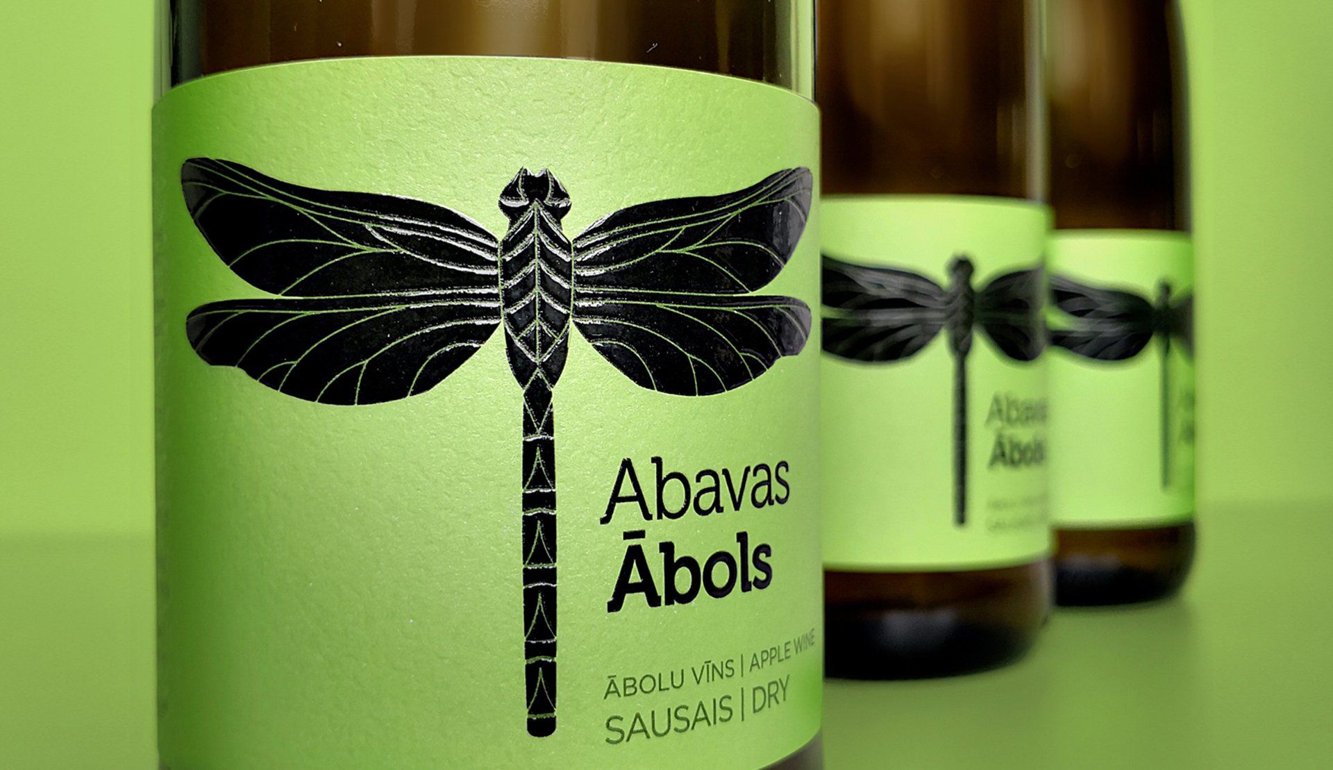
A dragonfly is the symbol of harmony between earth, water, and air
REFRESHING THE BRAND
A dragonfly is the symbol of harmony between earth, water, and air.
The Abava river valley is a part of the historic Courland region of Latvia. Its history of winemaking is several centuries old. Nowadays, a new generation of winemakers has taken over and developed a tradition into a new school of winemaking.
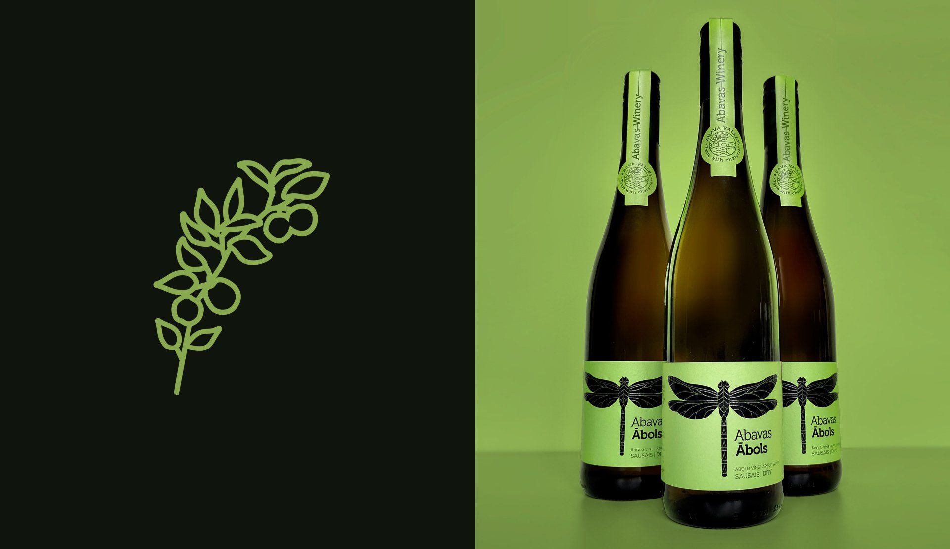
The Abavas winery bears the name of the small, but beautiful river, which is also home to over 50 species of dragonflies. For the winery a dragonfly is the symbol of harmony between earth, water and air, while upward motion inspires growth and development.
Staris is in charge of refreshing Abavas brand story and identity. After Abavas brand assessment, Staris provided the client with the summary and defined appropriate opportunities for further actions. Staris developed new product design labels which are the first stage of Abavas new design line that is more ascetic, internationally orientated, and has unified typefaces and cohesive stylistics. Product labels are enriched with the updated Abavas brand story and Abavas valley badge that shows the famous bridge over river Abava, and a copy – Taste with character. Staris emphasizes the dragonfly element in the product design since it is an element with great opportunities for designing labels due to the diverse possibilities to interpret the Abavas dragonfly design.

maris@staris.eu +(371) 29-431-999
© Staris Website 2021, all rights reserved