ETAGO
ETAGO
Intelligent life's quality
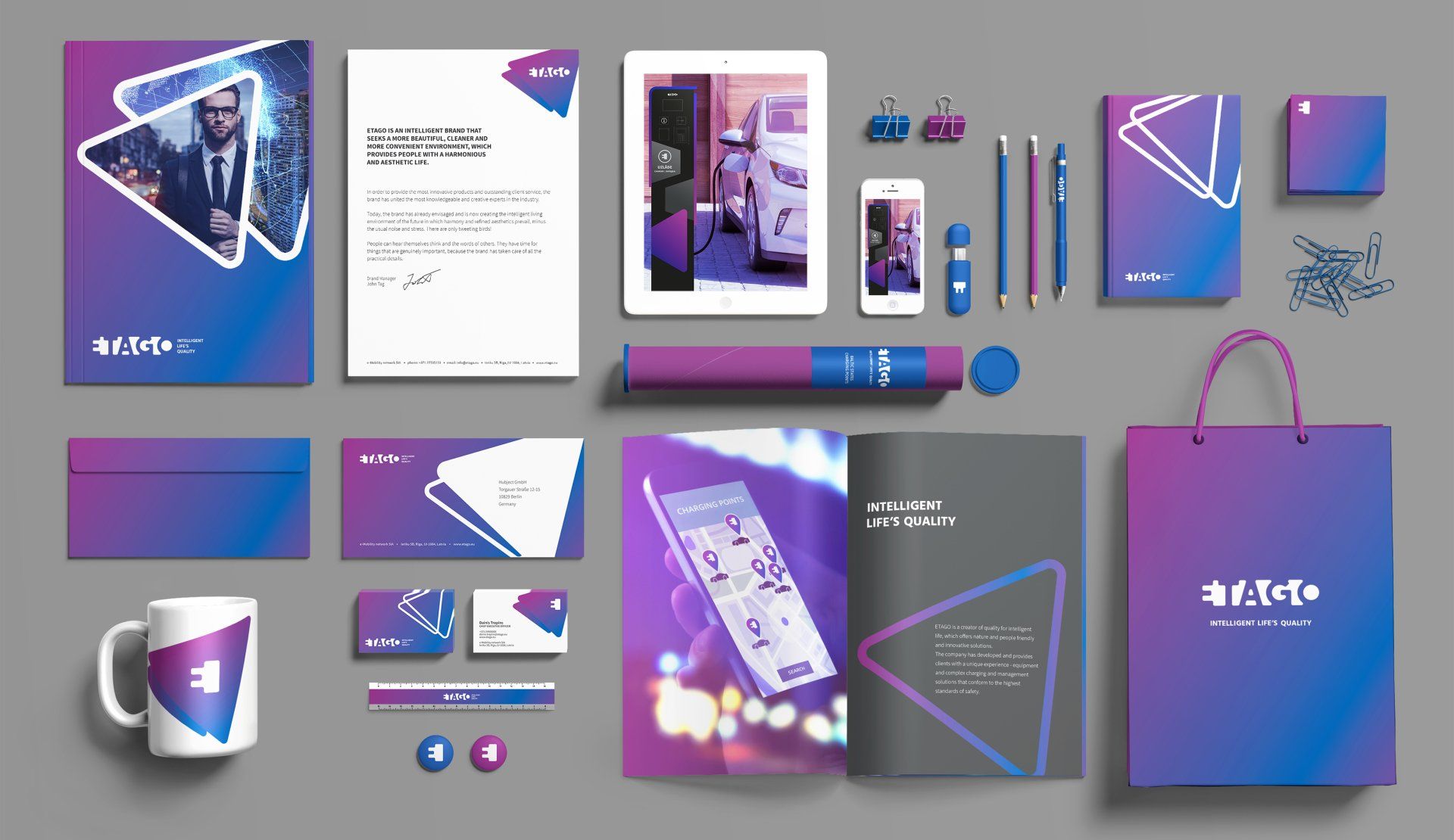
BRAND IDENTITY
The task for the Staris team was to create an authentic, innovative and powerful brand to be proud of and with which to ensure the company’s business successes in the short term and development over the long term. The primary target markets are the Baltic states, Germany, France and other EU countries and the target audience consists of real estate project developers – shopping malls, business centres, parking operators, hotels and restaurants, as well as private companies and local governments. The company produces electric car charging equipment and management that connects systems such as charging networks, car-sharing, e-Bike sharing, parking systems and intelligent home systems.
The Staris team developed a new e-mobility brand strategy, brand name and brand identity. The brand is positioned to be a creator of quality for intelligent life, which offers nature and people-friendly and innovative solutions. Today, the brand has already envisaged and is now creating the intelligent living environment of the future, in which harmony and refined aesthetics prevail – without the usual noise and stress.
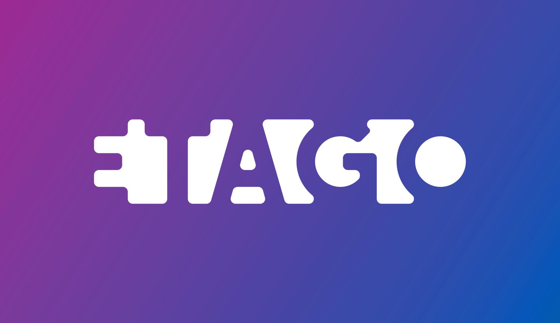
The company’s operating field is new and innovative, so a powerful and modern new word, ETAGO, has been created for its brand name. At the same time, this generates associations with two well-known English words, ʺtagʺ and ʺgoʺ, which allude to the company’s ambition – to create a new and innovative life environment category, and to become visionary ʺtrendsettersʺ. The brand name also has associations with the German word “tag”, which alludes to the meaning for day, which together with the letter e is an electric-powered day.
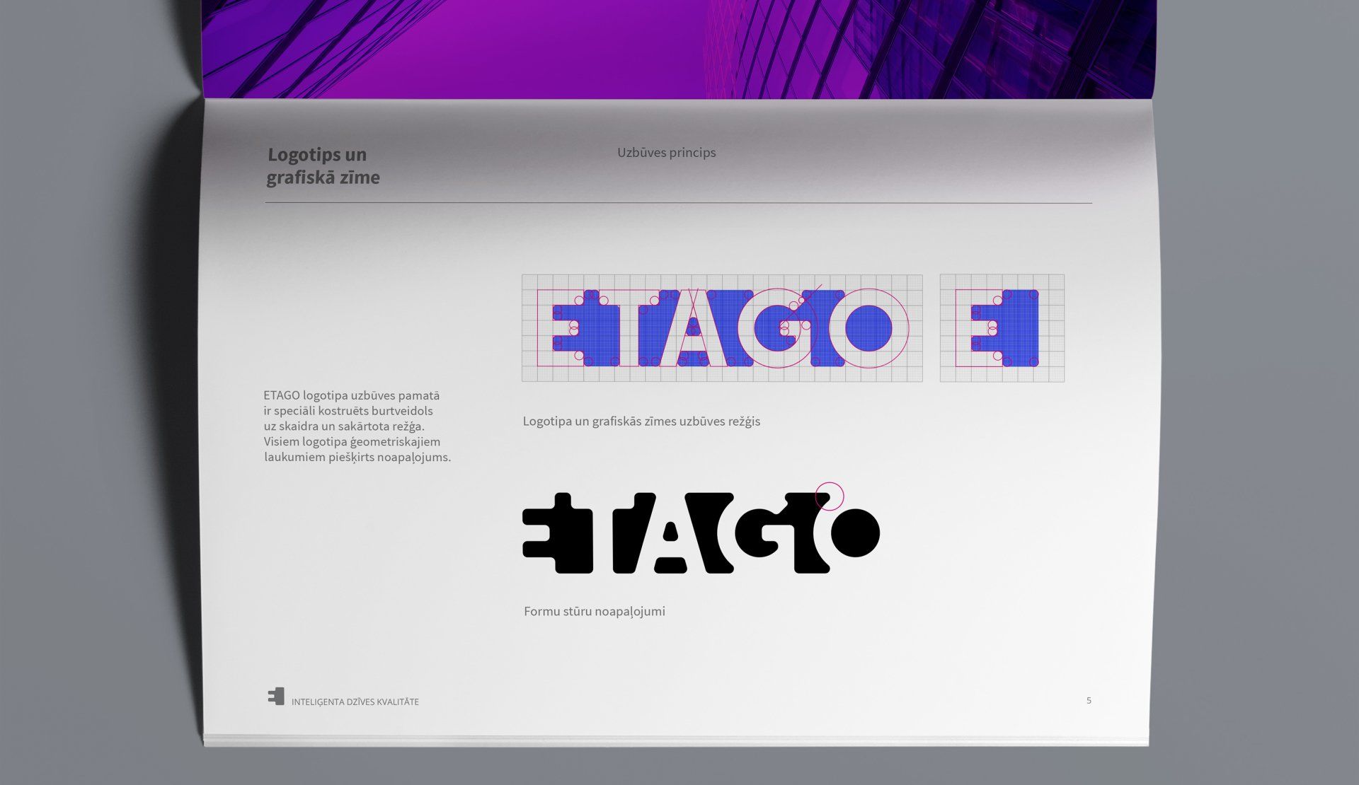
The logo is created according to the compositional principle of contrasting the internal and external fields. Beyond the name is a white field, which is in contrast to the name, thus creating the effect of a light and radiant nucleus. The light nucleus symbolizes charging and energy, whereas the name and the field related to the letters and surroundings symbolize the management of the e-mobility network and related services.
maris@staris.eu +(371) 29-431-999
© Staris Website 2021, all rights reserved