LINSTOW BALTIC
LINSTOW BALTIC
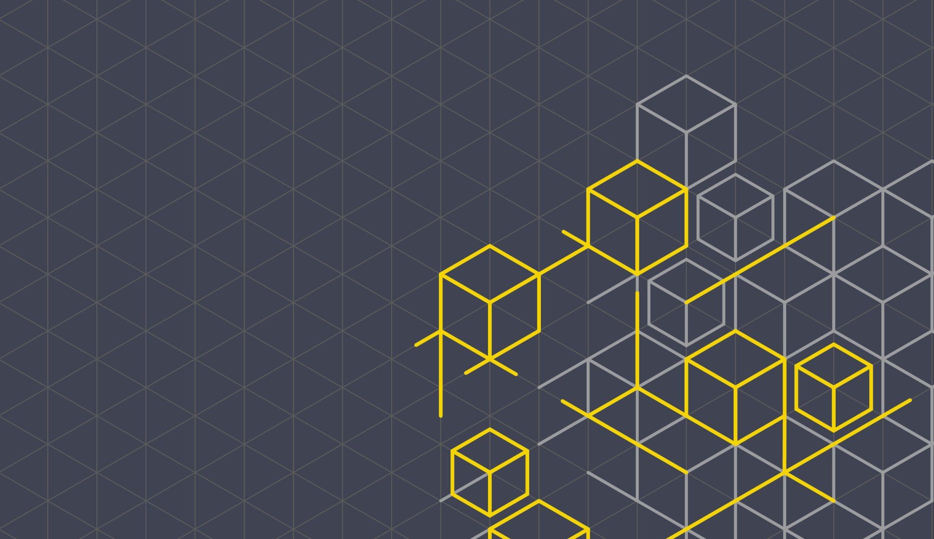
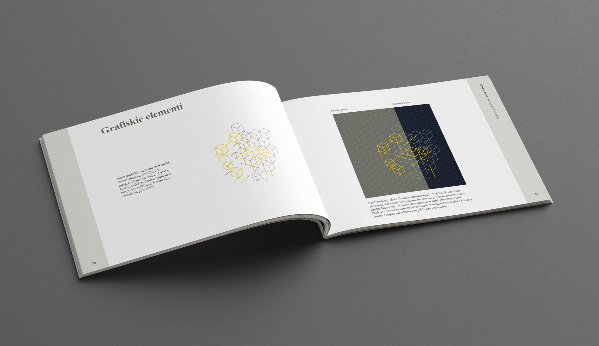
The graphic cubic shapes symbolize the design and management of offices and multifunctional buildings
CORPORATE IDENTITY
Linstow has an active ownership role in several major development projects within many different property segments. Among these are offices, health properties, shopping centres, hotels, leisure and parking properties. In the Baltics, Linstow is a major player in the shopping centres, offices and hotel market.
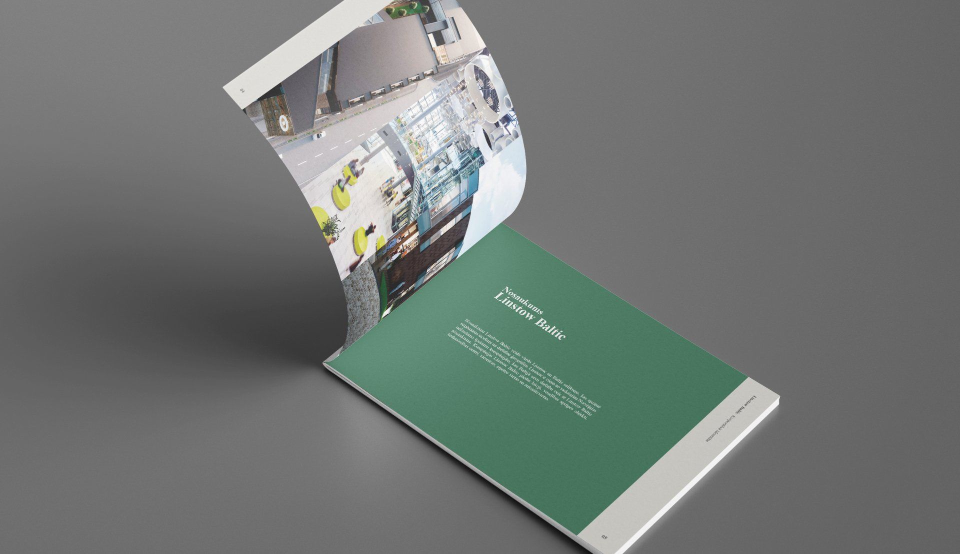
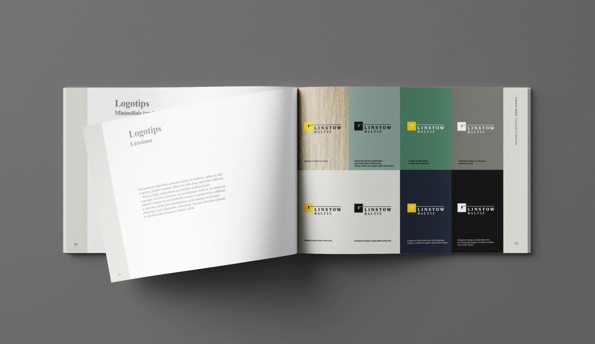
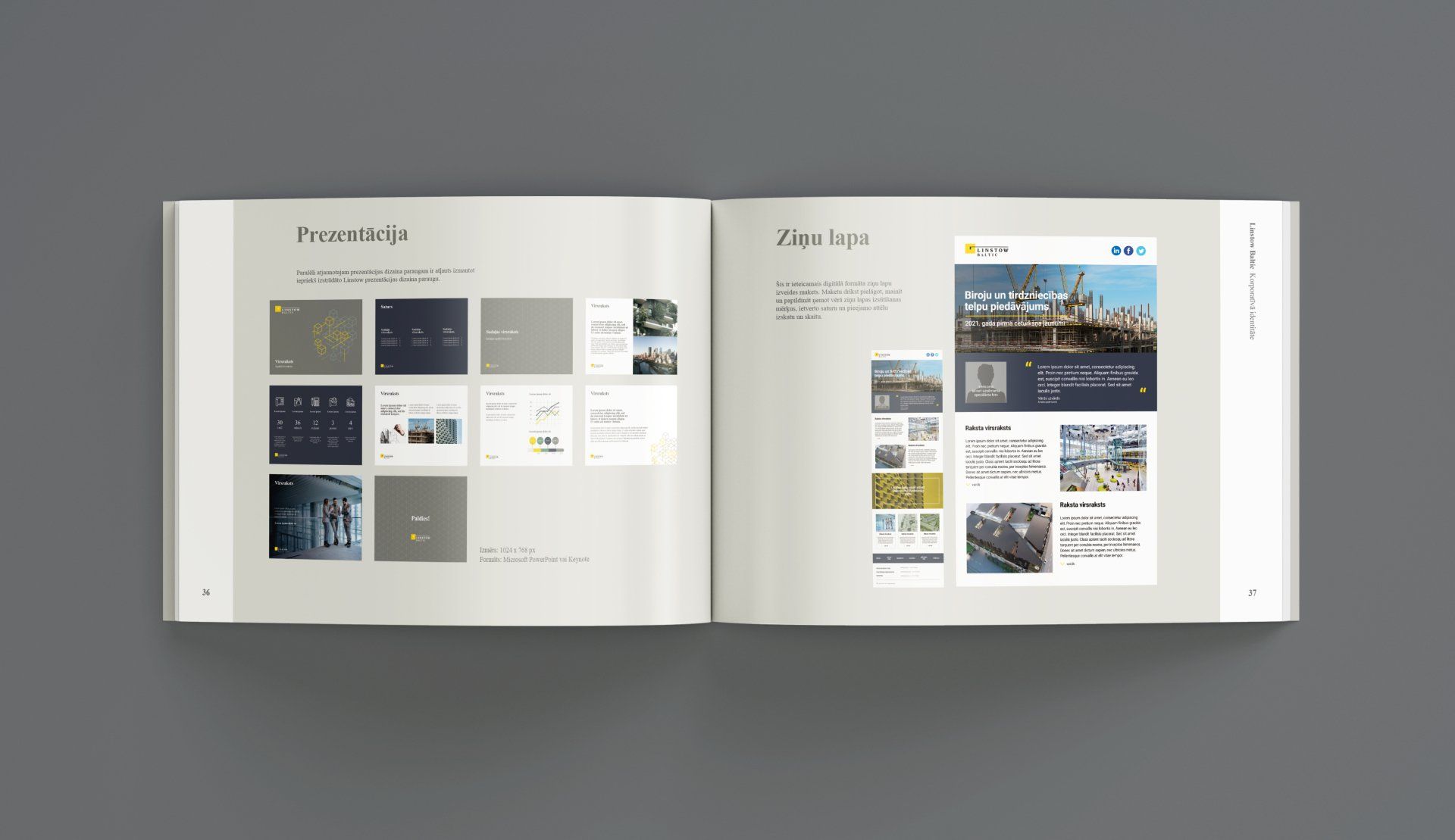
In 2021, the company changes its name, and its corporate identity is being renewed. Staris develops the renewed corporate identity, the already well-known Linstow logo is supplemented with the word ‘Baltic’. The renewed identity features an expanded corporate colour palette, muted shades of grey and green symbolizing sustainability – environmentally friendly operations and developed environmental quality in Linstow Baltic buildings. The graphic elements are being renewed, they represent unified, responsible and integrated operations of Linstow Baltic. The graphic cubic shapes symbolize the design and management of offices and multifunctional buildings.

maris@staris.eu +(371) 29-431-999
© Staris Website 2021, all rights reserved